Blinkist
Designing Through an Ambitious Product Pivot
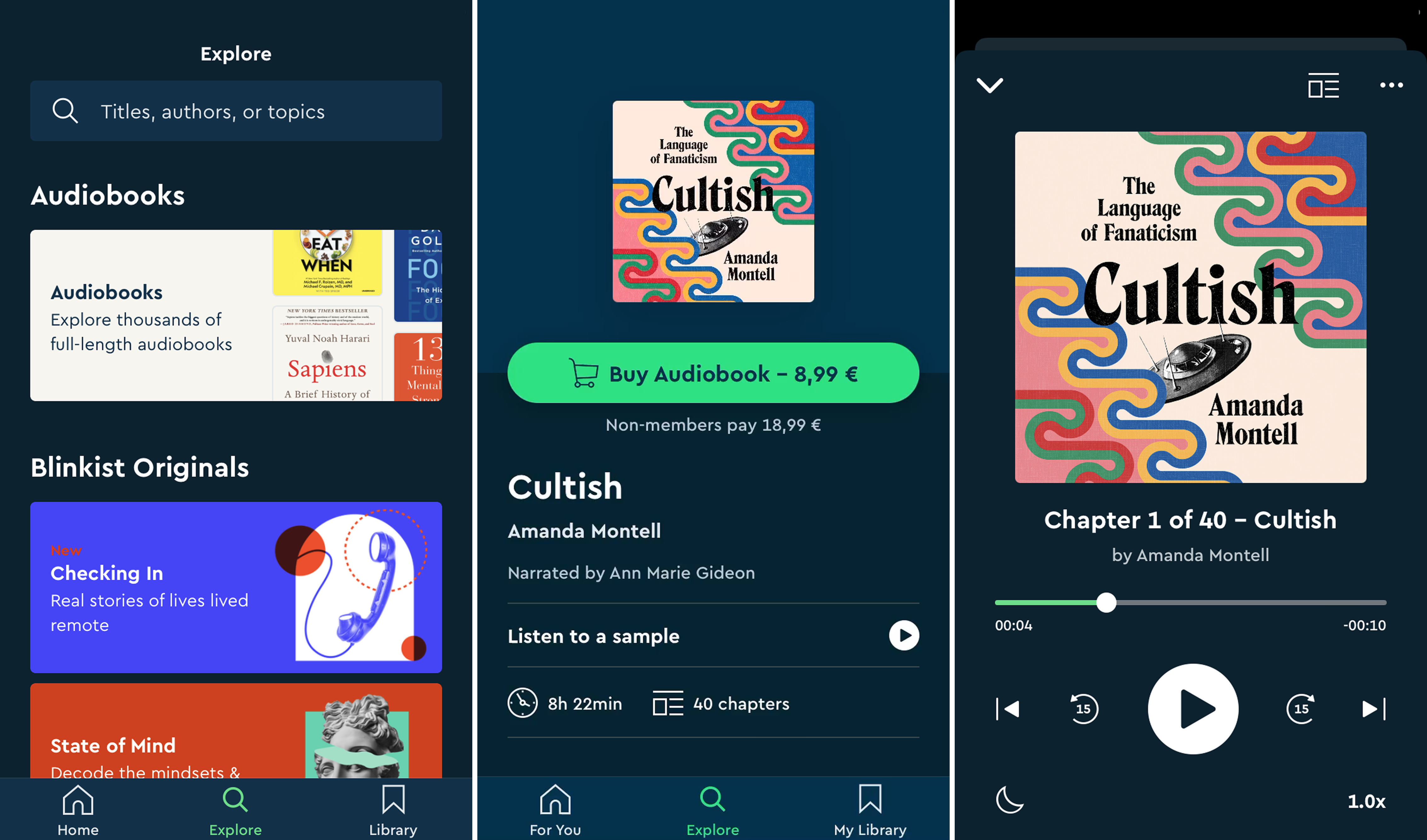
Blinkist built its brand by helping busy people fit learning into their lives through short-form summaries. In 2019, the founders made a major strategic bet: introduce full-length audiobooks — the biggest evolution of the product since launch. The opportunity was compelling: deepen learning journeys, keep users inside the ecosystem, and create a defensible moat as competition increased.
The challenge was equally real: audiobooks sat in tension with our core value prop of short and focused, and neither the product nor organisation had operated in this space before. This was category expansion under ambiguity, with a tight timeline and a value proposition at stake.
My role
This was a project where I operated directionally rather than hands-on. Designers were embedded in product squads across the org, so my focus was on creating the conditions for the team to do their best work under significant pressure.
Strategically, I led problem definition, aligned on success metrics, and partnered with research from the outset. I co-facilitated the design sprint that kicked off the project — working with a senior product designer to set the agenda and running cross-functional sessions with PMs, engineers, marketing, brand, and customer support.
At the executive level, I sat on a strategic council alongside the VP of Engineering, Director of Product, and Chief Growth Officer. This gave me a direct channel to raise design-critical questions early — before they became difficult to unwind. I used that access deliberately: advocating for the customer perspective, surfacing risks from testing, and challenging decisions that could undermine the experience or the existing Blinks value proposition.
Approach
We started by breaking down ambiguity quickly. I led a focused sprint to define the problem, surface risks, map behaviour, and test early hypotheses with users. This created alignment and gave us confidence in the direction before committing to build.
From there, we moved into iterative delivery supported by layered research — foundational research to understand listening behaviour, usability testing throughout development and a post-launch diary study to capture real-world adoption signals.
Designers were embedded in product squads, so I established alignment rituals, shared decision language and channels for critique and escalation. This ensured pace didn’t come at the expense of cohesion or comprehension across surfaces.
How this showed up:
- Design sprint: sharpening clarity, de-risking and understanding value
- Behavioural & foundational research: real context on listening habits
- Iterative usability tests: reducing risks along the way and refining flows
- Shared rituals & critique: designing for a coherent end-to-end experience
- Coaching & escalation paths: support through ambiguity and trade-offs
Early prototype
Shipped flow
Working across design
This work engaged the full design team — product design, research, and visual comms — with each discipline contributing as the problem evolved. Our existing critique rituals were vital for feedback and quality, and I set up dedicated working sessions when we hit meaty problems, ensuring the experience stayed coherent as we worked in parallel.
Research
Research ran across the full arc of the project. Following the sprint, behavioural interviews and iterative testing helped us understand how people discover and commit to long-form audio. Product designers translated those insights into flows and interaction patterns across squads.
Post-launch, a two-week diary study let us quickly identify friction points and early improvement opportunities — directly shaping the product roadmap in the months that followed.
The cover system
Sprint testing revealed a problem we hadn’t fully anticipated: users could no longer clearly distinguish Blinks from audiobooks. More concerning — our core offering risked being visually overshadowed by the new product. I made the case to the strategy council for a cover refresh, arguing that Blinks needed more distinct identity and prominence.
Evolving the cover system had been part of design’s strategic agenda for a year prior — we’d done initial explorations, but the conditions weren’t right to push it through. The audiobooks project gave us the catalyst.
Working with our Visual Comms lead, we moved away from the unstyled stock photography that had existed in the app since its inception toward a scalable visual language that clarified format and supported comprehension — protecting the Blinks experience while making room for audiobooks.

Outcomes
We launched across iOS, Android, and web in March 2020 — immediately before COVID lockdowns — delivering a complete audiobook interface and transaction flow, refined IA and content classification, a refreshed cover system, and web-based audiobook credit purchasing.
Despite the challenging timing, early indicators were strong:
- Elevated monthly subscription renewal rates among audiobook purchasers
- Robust audiobook repurchase activity
- Qualitative validation of multi-format value delivery
- Formalised discovery processes and research infrastructure for future initiatives
Reflections
This was a meaningful shift for the business, done while continuing to run the existing product. We were working in unfamiliar territory — none of us had deep experience with audiobooks — and there were open questions about how they’d fit our core value.
My priority was keeping the team supported and informed through that ambiguity. I created space for honest discussion, gave designers tools to make decisions with confidence, and coached on when to challenge versus align. I surfaced strategic questions early so unresolved tension didn’t sit with the team.
The work was demanding, but the clarity and rhythm we built helped the team navigate it.